

Getting colour right while simultaneously managing costs can be an unexpected challenge for digital-native brands moving into brick-and-mortar territory. Here are some of the considerations retailers and brands need to make in order to balance customer colour experiences in-store, at-home and online.
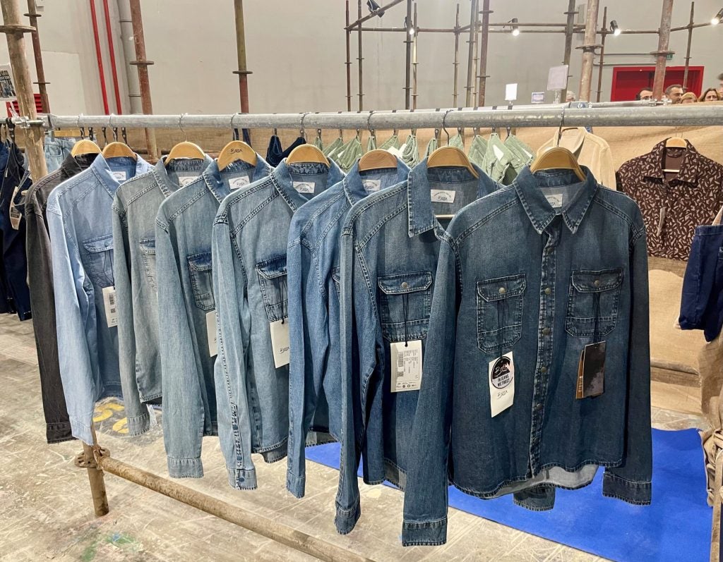
What happens when next season’s collection arrives and pieces that are supposed to match appear to be completely different shades from others? Or how about a customer who purchases a matching sweater and jacket in store, and is upset to learn the pieces are different shades upon returning home?
Go deeper with GlobalData

Brand equity hinges upon maintaining the quality loyal fans expect – and colour plays an indisputable role in this. In fact, when customers enter a store and turn to the racks, the first thing they see is colour, followed by style, then fit. That’s why colour management has always played an important role in the apparel production cycle.
Something that has become especially relevant for today’s retailers and brands is the need to balance apparel colour experiences in-store, at-home and online. Take, for example, a digital-first brand that opens a brick-and-mortar store – like ModCloth’s Fit Shops or Bonobos’s Guideshops. Web-only brands can face less pressure to ensure exact colour matches within apparel lines and coordinating sets, and they avoid many of the lighting issues that physical stores must overcome.
But by bringing their products into physical stores, these brands are presented with an added challenge to ensure accurate colour throughout the product development cycle.
See Also:
Getting colour right while simultaneously managing costs in these scenarios can be overwhelming. So what does it take to get apparel colour quality right? The following are just some of the considerations retailers and brands need to make in order to balance customer colour experiences in-store, at-home and online.
How well do you really know your competitors?
Access the most comprehensive Company Profiles on the market, powered by GlobalData. Save hours of research. Gain competitive edge.

Thank you!
Your download email will arrive shortly
Not ready to buy yet? Download a free sample
We are confident about the unique quality of our Company Profiles. However, we want you to make the most beneficial decision for your business, so we offer a free sample that you can download by submitting the below form
By GlobalDataLighting sources and their impact on colour
Lighting isn’t just a consideration for the fitting room anymore. Using the wrong light sources when garments are being developed, or inconsistent light sources across the product development cycle, can dramatically impact customers’ colour experiences. These colour changes are attributed to flare (change in the colour of a material when it is viewed under different light sources) and to metamerism (when two samples match under one lighting condition, but not another). Brands selling their apparel across multiple digital and physical settings will find this particularly impactful upon their customers’ colour experiences.
Choosing the right lighting can have a huge impact on quality and brand perception. Brands can limit these problems by selecting a light source for colour development that is the same as the source used in-store, then require its use by vendors and suppliers. Another option is to adjust colour standards in order to minimise issues due to flare. Changing the dyes used also has the potential to produce “colour constant” standards that look the same, regardless of light source.
Choosing the right colour palette
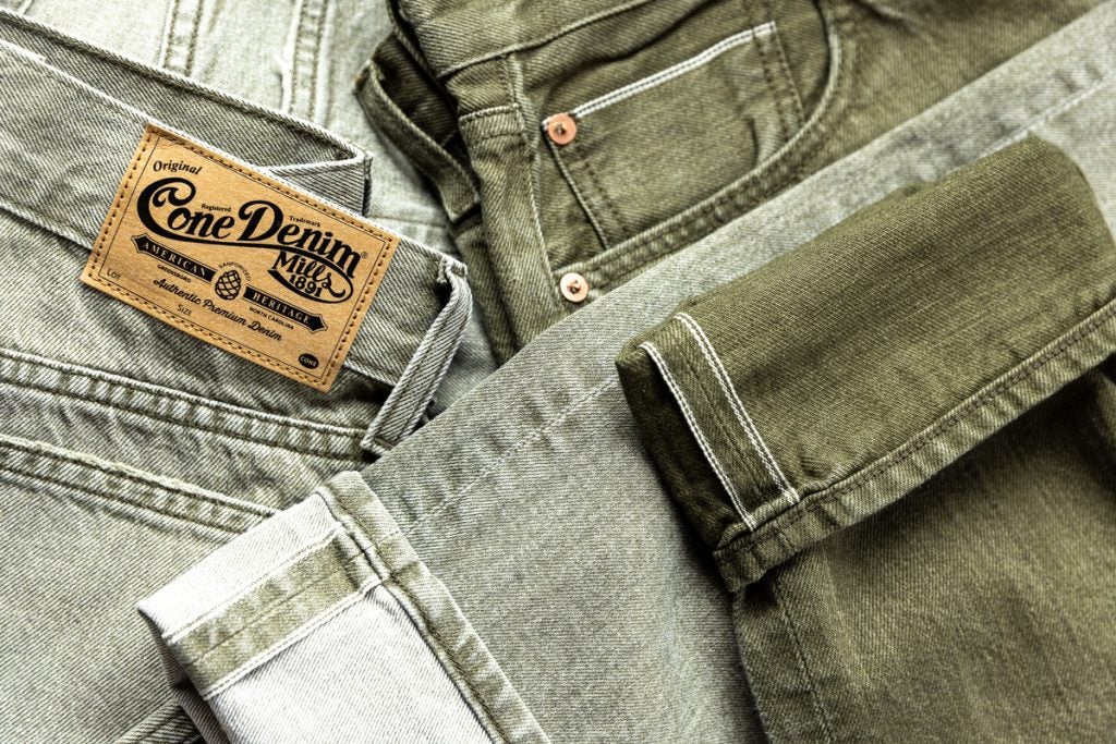
Chemistry limits the colors that can be successfully applied to certain fabrics – something that is especially relevant for specialty fabrics, like those used for activewear and athleisure. If colour specialists work with brands right from the start, ideally during the design stage, they can explain the technical limitations of colour and help specify feasible palettes. This integration ultimately accelerates the production process and can help avoid costly scenarios where brands don’t learn until well into the product development cycle that their colours aren’t achievable.
Another important quality consideration is the fabric itself. In addition to achievable colour application, considerations should be made for fabric sheerness – the way light is reflected from a fabric and the background it covers. Colour management equipment and an appropriate testing protocol have the added benefit of ensuring fabrics have an acceptable level of sheerness. And this could help avoid a disastrous crisis akin to the well-known see-through yoga pant debacle of 2013.
Communicating colours across the supply chain
Failing to adopt consistent, repeatable and accurate colour measurement and communication processes across the supply chain can lead to inconsistent colour experiences. That’s why digital colour measurement and management is widely accepted across the textile and apparel industry. By using specialised instruments and software, brands and mills can accurately measure colour and assign precise, repeatable, objective characteristics that can be digitally communicated across the supply chain. Digitising colour management ensures the colour of the final product matches the original palette and retains colour accuracy consistently across multiple runs. This is an important consideration for all retailers, but especially when you consider the impact of online, in-person and at-home settings, which can exacerbate colour discrepancies and dramatically impact colour experiences.
A caveat to this is multi-coloured or textured materials, which make up about half of all textiles. Inclusive of prints, lace, yarn and trims, these materials were, until recently, considered “unmeasurable” and had to be evaluated manually. Manual colour measurement relies upon a subjective visual assessment methodology that can lengthen the colour development process and requires the creation and shipment of physical samples for approval, which results in significant costs and delays compared to digital colour approvals. Thankfully, hyperspectral spectrophotometer technology has recently made its way into the textile industry, allowing textile and apparel brands to more fully embrace the efficiencies and accuracies of digital colour management.
Getting colour right is imperative for retailers to retain brand loyalists, ensure quality and save costs. All apparel brands are challenged to produce accurate, consistent colour, and this can become especially difficult when balancing colour experiences online, in-store and at home. As more and more digital-first brands begin to establish physical store presences, colour considerations will become ever so important. Thankfully, with the right colour management processes in place, accurate, consistent colour is achievable.


Related Company Profiles
Bonobos, Inc.
Datacolor
ModCloth Inc